Choosing Emotional
Color Palettes

Guide for Designers

Picking colors is an extremely important task for designers
and this page will provide some foundation and tips.

Color Psychology Claims

According to Brian Cugelman, articles about color psychology tend to make global statements about color psychology. These are over-generalizations that don't take
in to consideration various factors. What are these factors and what things should
you be considering when choosing colors for your project?

Things to Consider When Thinking
About Color Psychology

Mobirise

Cultures

Consider your target audience when choosing colors. Different cultures have different color associations and sometimes they can make different color distinctions. For example, in western countries red might be associated with passion or urgency, while in China it can be associated with luck and happiness.

Mobirise

Accessibility

When thinking about choosing colors, consider doing research on building color palettes for color blind people. It can be difficult when factors such as brand color and UX requirements have to be considered, but following good accessibility practices can allow for more wide-reaching emotional color associations.

Mobirise

Associations

There are a lot of cognitive associations to color. For example, people associate red with stopping because of stop signs and traffic lights. Color associations can be formed from individual experience, in groups, and culturally. Color trends and associations can also change over time.
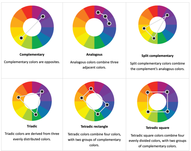
How to Choose Pleasing Colors

Mobirise
Use The Color Wheel

It can be very helpful and beneficial to look at the color wheel when choosing your colors. When deciding on using calming or stressed combinations, it is important to evaluate whether they will advance or undermine your design goals.

Definitions for Color

01.

Hue

Hue refers to the color, such as red, green, purple, orange, etc.

02.

Shade

Shade describes how dark a color is from vivid color to black.

03.

Tint

A color moving from vivid color to white (the opposite of shade)

04.

Saturation

Saturation refers to how a color transitions from its most pure hue (ex. blue) to grey.

Tips and Facts

What Colors Does Cugelman Suggest?

For critical messages, such as warnings and deadlines, he usually uses
warm colors, like red. For optimistic messages, he uses green.
For relaxed messaging, he uses blue, as it is not as attention grabbing,
but can be pleasing or comforting.
For pessimistic messages, he uses medium grey.

Visual Hierarchy

In order to control where the user's eye goes, it is important to utilize visual
hierarchy. One can do this by increasing or decreasing the saliency of visual
elements. That is, using colors, hues, and saturations to increase or decrease
the noticeability of that color.

© Copyright 2022 Amanda Ray - All Rights Reserved

Set up a free website - Go here