Tips and Tricks

6 tips on running an effective web design presentation.


1. Don’t improvise, have a clear plan

Before the meeting, send an email where you briefly outline why you’re setting up the meeting and which outlines what you plan to present. When starting the meeting: Repeat what you said in the email Explain how much of their time your web design presentation will take Explain what results you want to have reached at the end of the meeting.

2. Be strong and assertive

At entering the room, be assertive from the start, act confidently and own the room. Start with presenting yourself and avoid unnecessary chit-chat. Immediately run through the goals of the project and tell the client that todays presentation is about showing how your design meets these goals. Make you sure you don’t encourage your client to add personal opinions. Always keep the discussion centered around business goals.

3. Don’t go through each webpage element

Avoid starting your presentation at the top left of the page showing logo and subsequently talking your way through every element on the page ending at the footer. This might sound tempting but it makes no mentions of any the goals of the page. You’re basically just giving a tour of visual elements. Your client is looking at the same design as you, they’re not blind, so don’t treat them as such. Instead, explain why this design is the best way for them to fulfil their business goals.

4. Map your design decisions to goals and objectives, not specific features

Map your design decisions to your clients business goals. Don’t say, “And here’s the Pinterest share button”. Always frame the design discussion in the context of goals and strategies. A better way to present a social sharing button would be like this;
As we’ve decided that social sharing on Pinterest is important to your business we’ve addressed this by putting a clear call to action with a Pinterest button here and giving other social network buttons less importance.

5. Help your client help you

Don’t ask questions like, “What do you think of this?”. This leads to nowhere because everybody’s got an opinion, and of course your client will have one if you explicitly ask them to have one. Remember, you don’t want the conversation to be centered around personal tastes. Ask them to comment on something you actually want them to comment on. For example, ask them if the social sharing strategy should be based around Pinterest or Facebook. In any web design presentation clients will still give you feedback on stuff you don’t want though. In such moments, just stay calm, listen and recognise their feedback. If possible move the conversation back by asking them to connect the feedback to a business objective.

6. Be prepared to be wrong

Being prepared to be wrong is a good character trait of any good designer. Everybody’s wrong (expect Paul Rand when designing logos for Steve Jobs). Presenting design is also a conversation. Actually design presentations is best viewed as part of the design process. You’ve probably been in situations where the client schools you on things about his business that you had no idea of. How what you’re designing might be a bad decisions for their business. This is good, part of design presentations is to reveal obvious mistakes in your web design strategy. Your job then is to, in collaboration with your client, come up with the best possible solution that meets their business goals.

Presentation Tools


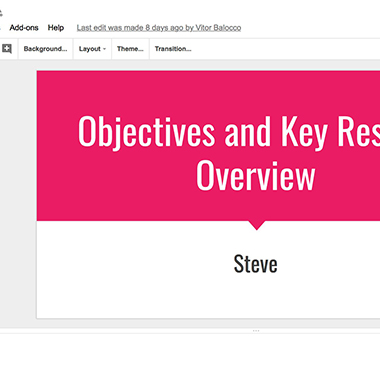
Google Slides

For collaboration on presentations

Google Slides—part of the G Suite family of apps—is a traditional presentation app designed around collaboration. It works much like PowerPoint and other presentation apps you've used in the past, only Google Slides runs in your browser, for free. Select a theme for the slideshow, then add standard slide layouts and insert text, graphics, and slide transitions from the menus. The new Explore sidebar can suggest layouts that fit the content of your slide, for an easy way to polish your presentation. You can then present from any browser or Google Slides' mobile apps.

Google Slides really shines when it comes to collaboration. Share a link to your presentation, and anyone you want can add details to your slides, write presentation notes, and anything else you want in your presentation. Add comments as in Google Docs to share feedback, then check back to see what was changed with Google Slides' detailed revision log. It's one of the best ways to collaborate on a presentation.

Google Slides Price: Free; from $5/month per user G Suite basic plan for custom domain and business branding
Zoho Show

For built-in broadcasting tools to stream presentations

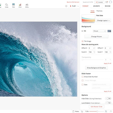
The newly redesigned Zoho Show is a clean take on traditional presentation apps. Slides on the left, tools on the right, and the slide you're working on in the center. You can add new slides with standard layouts, move text and images around on slides, and keep your style consistent with themes. You can collaborate with your team, with comments added to a sidebar for each slide.

When you're ready to show your presentation, you can flip through your slides in any browser as normal. You can also share a link to your slides so any attendees can download a copy for themselves. Or, you can broadcast the slideshow, streaming your slides online with live chat to talk with participants. It's an easy way to present your ideas online or in person with the same presentation.

Zoho Show Price: Free; from $30/month per user Zoho One for all Zoho apps for your business
Slides

For sharing team presentation assets

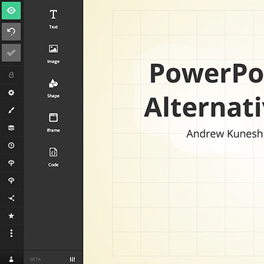
You know your boss gave a presentation about your blog stats last year, and the same presentation would work this year if you could just drop in your company's new logo and this year's stats. Slides is designed to let everyone in your team build from each others' presentations. You can save a shared library of designs, graphics, logos, and more to include in presentations, and can search through everyone's completed slide decks to find the details you want to reuse.

Then, when you go to design new slides, Slides editor makes it easier to keep things aligned with its built-in grid. Drag images, text, and more, and the editor will make sure your presentation doesn't come out messy. It's a bit more like a website editor than your standard presentation too—you can even customize your slide template with CSS, and present your slides online.

Slides Price: Free for public presentations; from $5/month Lite plan for unlimited private presentations, offline presentations, and PDF export
Microsoft Sway

For quickly changing your presentation style

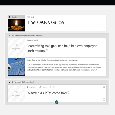
PowerPoint's detailed tools make it powerful—and distracting. You can build almost anything in PowerPoint, from a data-filled slide to a brochure for your business. But that flexibility also means it can be hard to get a basic presentation text and images lined up nicely. The new Microsoft Sway app helps by focusing on your content instead.

Start out by adding details to a Storyline or outline that can include text, images, links, and more with simple formatting options. Then, choose if you want your presentation to use standard slides or a more magazine-like right-to-left scrolling layout, and pick one of the built-in themes to format your content. It's an easy way to turn a handful of notes and images into a unique presentation where everything isn't forced into individual slides.

Microsoft Sway Price: Free; from $6.99/month with Office 365 Home for full Office
Prezi

For animated, non-linear presentations

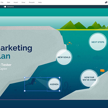
Tired of standard slideshows? Prezi is anything but that. It's more like a mindmap, with a large canvas that contains your entire presentation. You can have large graphics that connect everything—perhaps a galaxy, city map, ocean ecosystem, or detailed graph—with your points and graphics nested inside. The presentation starts zoomed out to give the big picture, then Prezi will zoom in to focus on the details as you go through your presentation, zooming out and back into a different point as you move on (which you can see in Prezi's presentation templates.

Editing slideshows in Prezi takes a bit more work than in a traditional slide-based presentation app. You'll first add new sections to your main slide, then edit the details inside a zoomed in part of that section—complete with text, video, and more subsections to zoom in further if you want. It's a fractal turned into a presentation.

Prezi Price: Free for public presentations; from $5/month Standard plan for privacy controls with unlimited presentations
Canva

For design focused presentations

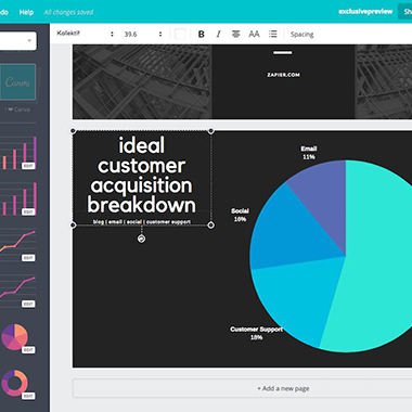
Want more customized slides, without having to create graphics on your own in Photoshop? Canva is designed for to make all types of design-focused documents: book covers, menus, magazine covers, posters, resumes, and more. Tucked among those options is a Presentation format complete with a tool to present your finished presentation right from the design app.

Canva is built around its included stock images, backgrounds, and specially formatted text boxes and page layouts that help you make polished, image-focused slides. Graphs are easy to customize, too, with premade layouts where you can add labels and numbers in a table to tweak the graph for your data. Search for any item you need then drag it into your slide or document, then click on that item to tweak its options from the menu in the top of the page. You can then share the presentation publically or present it right from Canva.

Canva Price: Free, with paid images and layouts starting at $1; $12.95/month per user Canva for Work for team plans
Prototyping Tools

When a big design project is potentially on the cards, you want to have the best tools at your disposal.

If you’re developing a web app or site, just showing stills of what it will look like may not be enough to satisfy a potential client. When they ask: “What happens if you click this button?”, telling them verbally can be a bit clunky. It’s much more impressive to show them, via a working prototype. And the best news is, you no longer have to spend a lot of time and budget on developing one. The last few years have seen a ton of tools landing on the market that make it quick and easy to get a prototype up and running. They include:

Sketch: A Mac-only tool focused on interface design that’s taken the design world by storm since its release in 2010. All the alternatives below are very much playing catch-up with Sketch.

Adobe XD: Adobe XD is Adobe’s answer to Sketch. Its most obvious point of difference is that it’s available for Windows as well as OS X.

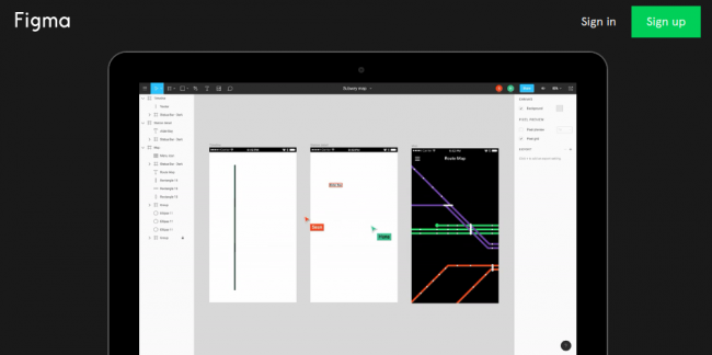
Figma: An interface design tool based in the browser, this free app makes it easy to collaborate on a prototype, even if your team is distributed around the world.

Subform: A CAD-inspired design tool centred around the unique constraints of UI/UX design, Subform puts a strong focus on the creation of responsive layouts with consistent styles, using real content.

When the design ideas you’re pitching to a potential client are more nebulous, freeform and open to discussion, it can be difficult to know what to show. This is where mood boards come in.

Rather than a mockup of a finished product, mood boards communicate creative concepts in a more abstract fashion. Featuring a collection of textures, images, text, fonts, colours and more, they’re about representing themes and encouraging discussion.

Mood boards can be analogue or digital, and when it comes to the latter, there are a number of apps that can help you create them. We’d recommend the following:

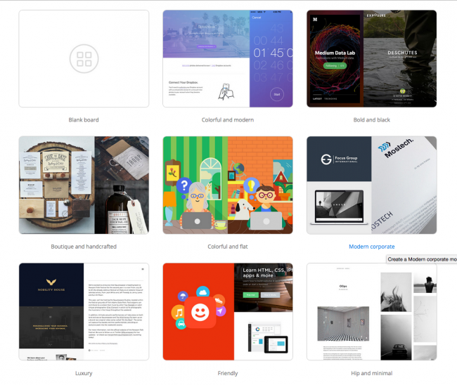
Moodboard: Unsplash’s free app for creating moodboards. You can start with a blank moodboard or use one of a series of templates, then share your moodboard with others via a link.

Boards by Invision: A plugin for users of the prototyping app Invision that helps you to creative mood boards collaboratively across teams.

The Matboard: A social bookmarking hub for the creative world often described as ‘Pinterest for design work’. Among other things, this cool app offers an easy way to collaborate on creating moodboards remotely.

Style Tiles: This online tool has been specifically designed for pitching web design projects. Style Tiles allows you to create digital moodboards featuring different fonts, colors and interface elements.

Best Practices

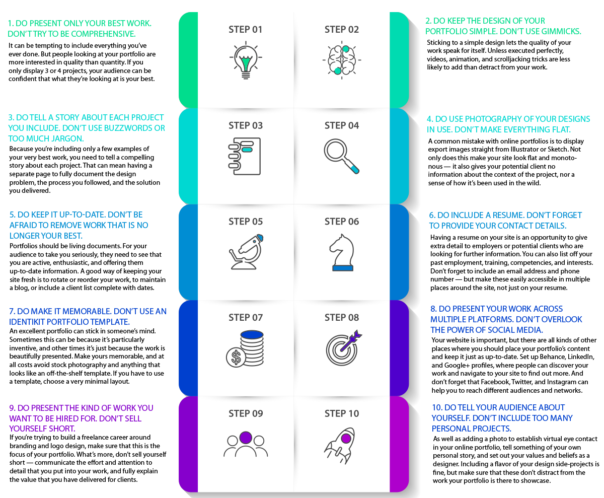
Do's and Don'ts


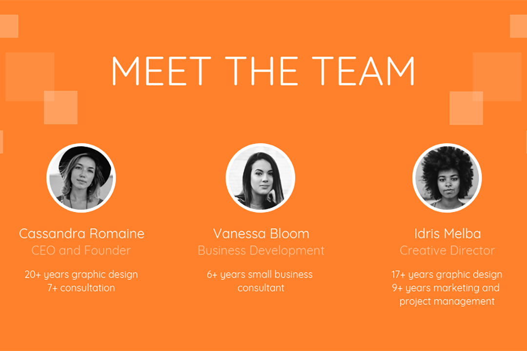
Gallery

Presentation Layout Ideas


The “rule of three” has been widely used in many mediums of communication to increase memorability and engage audiences. Similarly, if you want to take advantage of the rule of three, splitting the slide into three equally sized sections is an easy way to build layouts for a variety of purposes.

As dictated by the Picture Superiority Effect, pictures are more likely to be remembered than words. Pictures command attention more quickly. If you use more visuals than text in your presentation, your audience will be six times more likely to recall what you were talking about.

When you’re using evocative full bleed images to tell stories, as seen in presentations by orators like Elon Musk and TED speakers, you may want to include a few words to give the image context.

If there isn’t enough contrast between the background and your text, consider using shapes to frame the text. This way, your audiences can still read the text and be able to see the image of interest as well.

If your full bleed image has empty space, it’s the perfect area to place your text without too much guesswork.

By splitting your slide equally using horizontal bars, you can instantly see a usable layout for your information. It doesn’t take much guessing to know where you can place content in these cases. Just fit it to the grid you made. This is similar to the three-part layout but allows for a different kind of representation of information.