Loading...

How to Pick the Perfect Font Style Design for your Website

Font choices are absolutely not random at all.

01

Personalities

  • Font Designs and What do they mean?
    Different font designs give off different impressions.
    Traditional
    If you want your website to represent thispersonality, the fontsyou should consider should be designs that have been around for a very long time, such as Georgia, Trajan, and Times New Romans. These fonts have traditionally been used in prints like newspapers, magazines, and books.Since most people are very familiar with these classic font designs, they instantly give off the impressions of heritage, reliability,and trust.
    Strong
    These fontsare very bold and have a blocky design.The boldnessof thefont designsgivethe design substance and give off the impression of strength. If you want tomake a statement or want to appear robust, thisis thetype of font you should use.
    Beauty
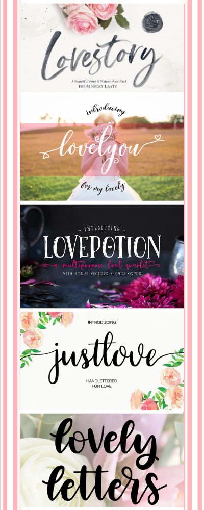
    These are handwritten-type font designswith lotsof curves.The curvesarewhat give the designsa romantic and elegant feel.Not all handwritten font designsare romantic, they can also be quirky and free-spirited.Themore italic and curvy the font design, themore vintage it will look.The rounder the font design, themore quirky and retro it will appear to be:
  • Contemporary
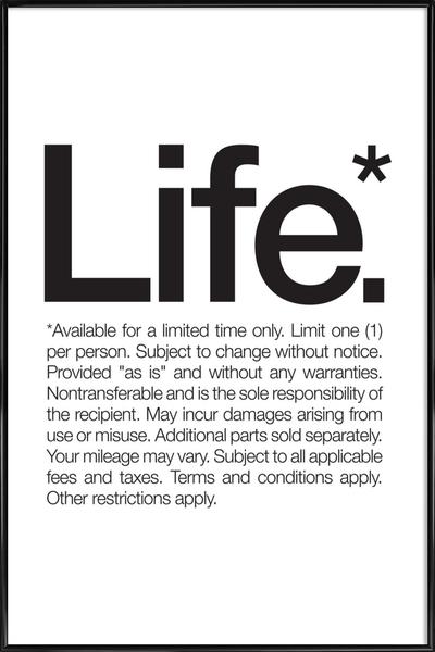
    These are fontswith very clean designsand haslesshandwriting qualities. They often have either very bold or very thin profiles.These designs tend to have less personality so they appear moremodern. If you want your websiteto giveoff amore contemporary feel,then consider using thistype of font design.
    Themed
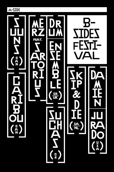
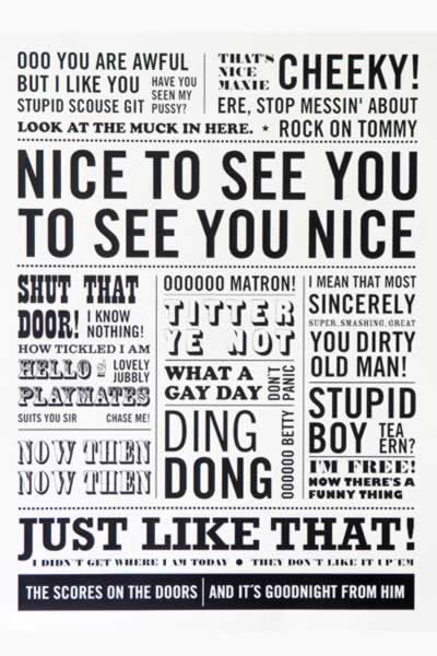
    These are font designs that don?t fall into any specific category because they are so stylized. They have various characteristicsand so it?shard to cover all of them.These font designsare handy if you want to create a unique brand identity. It will require more design skills to pick out the right design since all of themare very specialized.
02

Tips +Tricks

03

The Don'ts

AVOID

The 7 "deadly sins" to avoid when choosing a font style for your content.

There are books that are written specifically just about the design and science behind typography.

While they are great if you want to become a professional designer, it is a bit of an overkill for average folks like us.
Instead of going through all the theories and technical mumbo jumbo, I’ve put together these 7 things to absolutely avoid when picking a font(s) to improve your website’s readability.

This specifically targets the content area of your website (such as paragraphs of description, blog posts, etc).


  • 1.

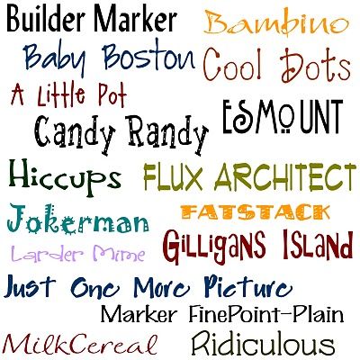
    Don't use tacky fonts

    It might be something you want to use on your kid’s birthday party invitation, but tacky and funky fonts have no place on any websites that want to be taken seriously. Each font design has its own personality.
  • 2.

    Don't use messy fonts that are hard to read

    Picking a font design for your main content is very different than choosing a font for your title / headline / logo. The purpose of your website content is to deliver useful information about your product or service offerings to your readers. So readability is very important here.
  • 3.

    Not giving your lines
    enough space

    One of the easiest ways to make your content easier to read is to add enough spacing between each line. The magic number of a perfect line-height is 150% of the font size you are using.
  • 4.

    Don't use too many different font designs

    Less is always more when it come to design. You want to keep the number of font designs on your website to no more than 4.
    • 1 font style for Headline or Page Title
    • 1 font style for Subtitles
    • 1 font style for body content areas
    • 1 font style for quotes
    Too many styles of fonts can make your website look messy and unprofessional. People might have a hard time figuring out what are the important messages you are trying to communicate.
  • 5.

    Don't use too many font colors

    Color is a powerful branding tool. When you are choosing color(s) for your fonts, only pick 1 or 2 brand colors that truly represent you or your business to use in your headline or
    sub-headlines. Anything more than that will just look messy and circus-like.
  • 6.

    Don't randomly pick font sizes

    You can pretty much choose any font sizes you like on your website. But before you start randomly assigning sizes to your headlines and subtitles, I want to introduce you to modular scaled font sizes. What are modular scaled font sizes? It is a series of harmonious font sizes that have the perfect proportion that the general public view as “beautiful.” We are drawn to things that are beautiful and most beautiful things have perfect proportions. Believe it or not, this goes the same for font sizes! So instead of guessing what font size you should use, why not just do yourself a favor and use the following sizes that are said to have the perfect proportion based on some mathematical model. Recommended Font Sizes: 8, 16, 24, 32, 48, 64, 95 16px is the ideal font size for your main body text. It is not too small or too big, so it really helps improve your paragraph’s readability. In fact, the font size we use in the main content areas of our articles is 16px. Simply stick with this guideline and you will always get the perfectly proportioned font sizes!
  • 7.

    Not enough white space

    It is so easy to crowd your webpage with tons of information. More content is better, right? But when you are jamming too much content without any adequate breathing space on your pages, it can leave your visitors feeling overwhelmed as they have to focus extra hard to absorb the information. So, how do you do that? Pretty simple – just make sure you leave more white space between your paragraphs and between different content on your pages (we have examples below). White space is simply the gaps or blank area between content like headline, subtitle, body, images or videos — simply put, it’s the empty spaces on a page. This is one of the easiest things you can do right now to instantly make your content easier to read.
04

Caring

05

VISITOR

Different font styles communicate different subconscious messages to people – which can help you build brand identity.
Believe it or not, specific font styles can convey different messages such as trust, stability, strength, elegance / sophistication, creativity, etc to people. Imagine if you want to build a website for your accounting or legal business, what type of font design do you think you should use? Would you use the same font style if you’re building a wedding photography business website? Probably not.
It can help you grow your business.
Using the right font design with the right layout design can make your readers feel more comfortable, increasing the chances that they will read more of your content material. This helps you build trust with your visitors (as they consume more content) and therefore gives you a better chance of growing your business. Let’s face it, your business will not grow online if your visitors don’t feel comfortable with reading your material on your webpages.


06

Right+Font!

Design

Think of different fonts as different outfits you’d wear to various occasions.

For instance, if you are going to a fancy dinner party, you might wear an elegant dress or a sophisticated looking, pinstripe suit.

If you are going to the gym, you might put on some sweats and a random shirt.

Your outfit creates a visual representation of who you are – and you can choose to wear different outfits to the same event to alter that perception.

Simply put, your choice of clothes says something about you, like your style, your personality, your age, and even your wealth.

Think of wearing a casual polo shirt with slacks and loafers versus a crisp white collared shirt, paired with a pair of pressed charcoal dress pants with polished, black leather dress shoes – this gives people a very different view of who you are.

The font design you choose acts the same way as your choice of outfits — the type of font design you pick says a lot about you, your business, and what your website is all about.

You want your outfit to be purposeful and appropriate to the event you are attending. You also want your outfit to represent who you are.