Topic Project
What is a website style guide?
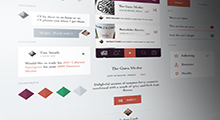
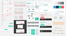
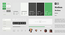
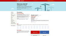
Ever wonder what a website style guide really is? Well it's a manual that sets the design standards for a company's brand identifiers, like documents and signage. Its key purpose is to create a universal design style for the brand and ensure consistency across all channels and mediums. This is where you establish your logo, color palette, typography, imagery guidelines, and so on. From the research I have gather it says that some print versions of style guides go back over 100 years ago. But as the web has continued to become the use of everything now there isn’t as many print versions but more website versions. This way it makes it easier to share information with people that are not in the same area as you.
Process
Step 1: First, you need to study the brand so that you understand what it stands for. Get to know the story behind the brand, observe the team and figure out the vision, mission and values of the company. It is important to dig deeper into the brand so the style guide you produce will visually and emotionally represent the organization.
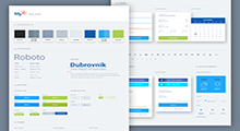
Step 2: Begin by setting primary colors for your style guide that will dominate your website, dominant colors should include no more than three shades. In some cases, however, you will need secondary and even tertiary colors to illustrate your user interface, make sure you define them too. Also include neutral colors like white, grey and black for the primary brand colors to stand out.
Step 3: You must get typography right because it is one of the most important communication tools between visitors and your website. Set hierarchy and identify it. There are headline types: h1,h2, h3, h4, h5 and h6. Then body copy, bold and italic variations. Think about custom copy that will be used for smaller links, intro text and so on. Provide font family, weight and color.
Step 4: Buttons are a mixture of color palette, forms and voice. Rely on these previously created assets to create consistent looking and functional buttons with different stated designs.
Step 5: Forms are what make your website or web app interactive and dynamic so the user can enter the data and you can then manipulate it and do the work. Make sure to establish a hierarchy and include possible feedback from forms — active, hover, add error, warning and success messages including things such as a password being too weak, email being not valid or simple success messages e.g.“email was sent.”
Step 6: Take advantage of using icons in your projects because they will give an instant idea to visitors as to what’s going on and what will happen next. Picking the right icons will give more context to content than color palette, copy or graphics. When using icons, make sure to think about the target audience, religion, history, so you avoid misconceptions and misunderstandings. One more thing to mention, think about the brand and its values so you don’t use hand-drawn icons on a large banking website.
Step 7: In addition to helping visually organize elements, a grid system also offers a great deal of visual and structural control over your page. It makes it easier to create magazine-style layouts or online creative portfolios, which would be a nightmare to code from scratch and hard to visualize. Elements like text callouts are also easier to produce and place.
Step 8: The best signup forms include no more than the absolute bare-minimum required information. If there’s no financial transaction involved, then it should be limited to email and maybe name.
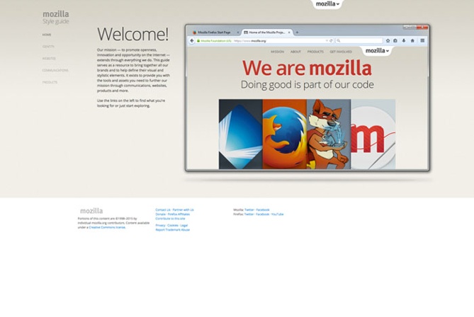
Style Guide Examples
Keep in touch