Principles of
Readability and WebTypography
Typography Readability
Typeface
Some typeface families are made up of two or more sub-families. ITC Stone is a good example. Its sub-groups consist of Serif, Sans, Humanistic and Informal. Each design has roman and italic versions in three weights for a total of 24 individual typefaces. The four designs share the same cap height, lowercase x-height, stem weight and general proportions. Each typeface, however, is designed to stand on its own as a useful, distinctive communication tool. Thesis and ITC Legacy are two other popular typeface families that are made up of sub-families.
Font-size
Getting people to read and understand what it is that your website is trying to communicate is not as simple as one might think. ... In general the findings showed that readers where more focused on reading when the font was smaller than when the font was larger.
Color
When visitors come to your website, they produce three types of feeling for your business – Yes, No and Wow! The type of feeling your visitors must create for your website is entirely in your hands. How? Build a breathtaking website that is as clear as it is beautiful, otherwise it will turn off your visitors and generate poor first impression about your brand. The two major factors that will determine the success of your web design are: Fonts and Color. The font-styles/typefaces and color you choose for your website have a huge impact on user experience.
Organizational Readability
Hierarchy
Headings
Separators
Organizing Principles
User-Friendly Headers
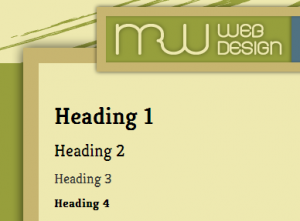
User-Friendly Headers are a key element in typography, Web and print alike. As mentioned, they are part of the text hierarchy and a major factor in scannable content.
Scannable Text
Making copy scannable consists of good use of headers, hierarchy and focus points to guide the user through the content. So, what makes copy scannable? Well, there are many factors, most of which have already been mentioned. Header size and position, body text size, text line height, text contrast and the way focus points are differentiated all impact how scannable copy is. Focus points are certain elements or objects within the layout that attract, or are supposed to attract, the user’s attention. This could be a header, a graphical element, a button, etc.
White Space
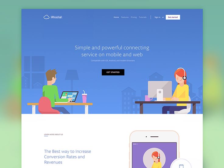
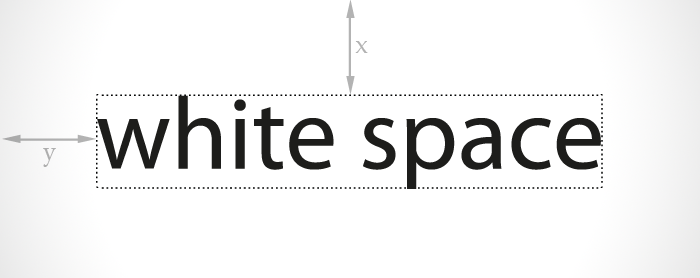
White Space In content-heavy layouts, spacing contributes to the readability of content. White space helps to offset large amounts of text and helps the user’s eyes flow through the text. It also provides separation between elements in the layout, including graphics and text.
Consistency
Consistency is often regarded as an important technique for usability, but it also applies to readability. Consistency in the hierarchy is important to a user-friendly layout. This means that all headers of the same importance in the hierarchy should be the same size, color and font. For example, all h1 headers in an article should look identical. Why? This consistency provides users with a familiar focus point when they are scanning, and it helps to organize the content.
Density of Text
Density of text refers to the amount of words you place in one area. Density of content has a major impact on your content’s readability. Density is affected by spacing options such as line height, letter spacing and text size.
Emphasis of Important Elements
Emphasis of Important Elements is Another key factor is emphasis of certain elements within the body content. This includes highlighting links, bolding important text and showing quotes.
Organization of Information
Organization of Information Believe it or not, the way you organize information in an article can strengthen readability. Users are guided with ease through content that is properly organized because information is easier to find.
Clean Graphical Implementation
Clean Graphical Implementation Every text body needs some sort of visual support, be it an image, icon, graph or illustration. Placing the graphic in the article can be challenging. Sufficient space is needed between the graphic and text.
