BALANCE
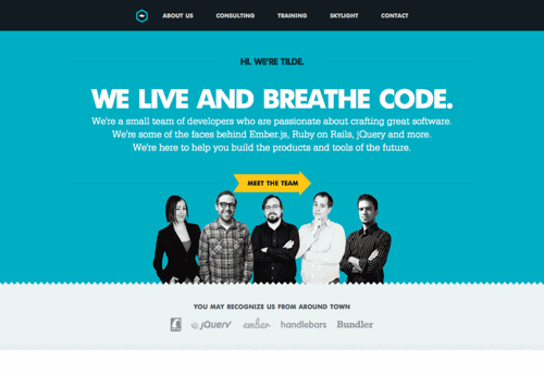
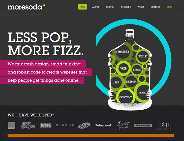
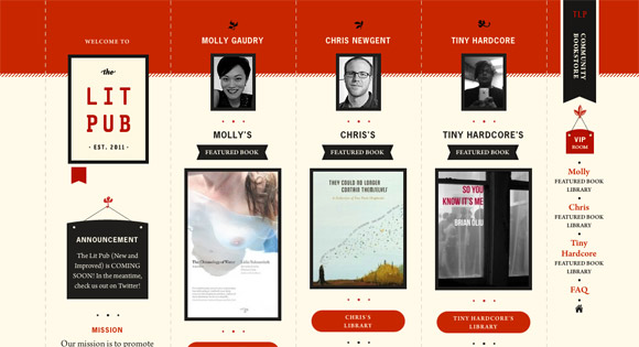
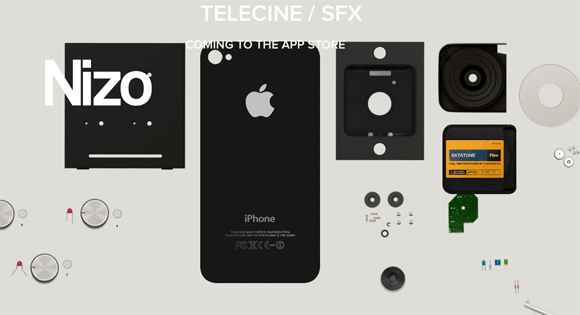
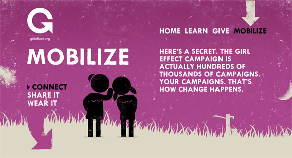
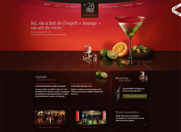
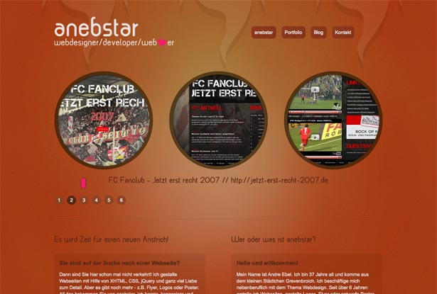
Balancing a composition involves arranging both positive elements and negative space in such a way that no one area of the design overpowers other areas. Everything works together and fits together in a seamless whole. The individual parts contribute to their sum but don’t try to become the sum.
An unbalanced composition can lead to tension. When a design is unbalanced, the individual elements dominate the whole and the composition becomes less than the sum of its parts. In some projects, unbalanced might be right for the message you’re trying to communicate, but generally you want balanced compositions.
EMPHASIS
In a design emphasis is how an eye drawn to in a design. As a designer one should determine the page hierarchy and then the emphasis should be applied to the elements.
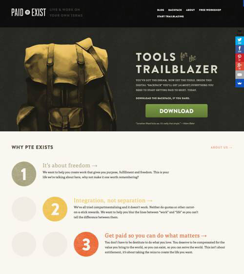
Your dominant element is the starting point for the story you’re telling. It’s the entry point into your design. It should attract visitors to the first place you want them to look.
This is how you start a conversation with visitors. The dominant element is noticed first and sets the context for what’s seen next. It’s at the top of the hierarchy. It should emphasize your most important information, because it might be the only thing anyone will see. Whatever message you want people to take away should be clearly communicated in or near your dominant element.
Without an entry point, viewers will have to work harder to find their way into your design. They’ll have to pause and think where to look first and think about what’s truly important on the page. A lack of entry point will increase the cognitive load on visitors. Don’t make them think. Provide an entry point into your design.
RHYTHM
Rhythm can help control the pace of flow in a composition; it’s patterned movement. Rhythmic patterns are built from elements and the intervals between them, and just as your ear will follow along with the rhythm of a song, your eye will follow rhythm created visually.
A pattern and a rhythm will exist as soon as you add multiple elements to the page. Two of anything implies a structure. It’s going to be there no matter what you do so, again, you should learn to control it.
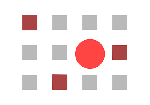
Repetition creates flow and rhythm through the repeated elements. When the eye sees a red circle it notices other red circles in the composition and seeks to establish a pattern. In addition to repetition you can use alternation and gradation to create rhythm.
- Repetition: creates patterns through predictability.
- Alternation: creates patterns through contrasting pairs.
- Gradation: creates patterns through a progression of regular steps.
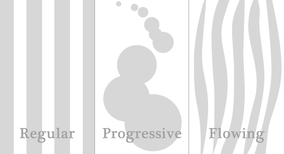
There are three primary types of rhythm:
- Regular rhythm: occurs when the intervals between elements are predictable, or the elements themselves are similar in size and length. Placing repeating elements at regular intervals would be an example.
- Progressive rhythm: occurs when the sequence of forms or shapes is shown through progressive steps. Some characteristics of elements might have stepped changes, or the interval might have stepped changes. This gradual increase or decrease in sequence creates movement. A color gradient is a good example.
- Flowing rhythm: occurs when the elements or intervals are organic. This creates natural patterns that evoke a feeling of organic movement. Stripes on a tiger or zebra are good examples.
UNITY
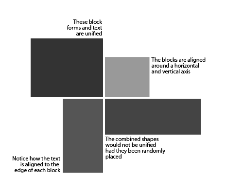
Unity. It’s a very important concept in design and one that is actually pretty easy to achieve. Unity is simply that, the unification of objects within a composition. Unity is the measure of how objects or elements fit together — or don’t for that matter. Its really just a matter of linking elements together to create harmony. This harmony in elements can be accomplished through:
- The physical proximity of elementsCreating unity with proximity is easy because elements grouping elements together tells the viewer that all these elements belong together in the same “box”.
- The repetition of elements or the repetition of element attributesRepeating style elements will help to unify the entire site.
- The continuation of lines and edges within a design — how elements align and group together.It’s simply using visual lines and edges to group elements together.
CONTRAST
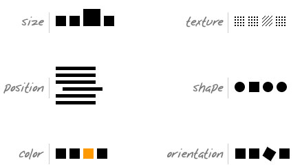
Contrast can be defined as “the difference in visual properties that makes an object (or its representation in an image) distinguishable from other objects and the background.”
- Color ContrastThe most common example of all, this is pretty much where it all starts. If two colors are different to each other (say, black and white) they have high contrast, whereas if they are very similar (red and orange) then they have low contrast.
- Size ContrastThe next most common form of contrast is using size. Something big beside something small generally indicates that the bigger item is far more important. That’s right, we’re saying that size matters!
- Shape ContrastShape contrast means making things notable in by their difference in physical shape compared to other things on the page. At its most basic level this can be used in things like adding rounded corners to buttons, but taken to more extreme levels it can attract a lot more attention.

