What is color psychology?

Color psychology is the study of how color affects our emotions and behaviors. Depending on your upbringing, cultural background and personal preference, certain colors can make you feel a certain way.

Why does the psychology of color selection matter?

Have you ever noticed how a yellow room tends to make you feel brighter or happier? Or how a red dress can make you feel a sense of passion, while a red sign can alert you to danger?

The topic of color psychology can be a bit complicated because color and feelings can be highly subjective. But studies suggest that color does influence emotion in specific ways.

Color selection can make a big impact on the reaction of your audience and how they feel about your product. It can provoke hunger, inspire trust or elicit a feeling of calm or excitement. This is why every color should be selected strategically to contribute to the overall goals of the piece.

Fun Facts About Color

Learn more about color.
What is the World’s most popular color?

Blue

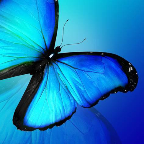
According to various international studies, the world’s most popular color is blue. Based on the survey conducted by several global marketing firms, they’ve concluded that people worldwide picked blue (40%) as their favorite color followed by purple (14%). Though some researchers also suggest that red and green are a close second and third respectively. White, orange, and yellow are some of the least favorite colors.

What is the first color a baby sees?

Red

Recent studies have shown that infants as young as 2 weeks of age can already distinguish the color red. Probably because red has the longest wavelength among colors making it the easiest color to process by the developing receptors and nerves in the baby’s eyes.

What color can make you dizzy?

Yellow

The color yellow can cause nausea, so it is avoided in airplanes. Also, pure bright yellow is believed to be the most irritating color due to its excessive stimulation to the eye. Huh! Knew it, yellow!

What does each color represent?

Here is what you need to know.

Consider your colors wisely

Graphic design is more than just choosing a few colors that look pleasant together. Understanding the psychology of color and knowing how to use it strategically is one of the basic fundamentals of graphic design.

Color theory is just one of core competencies covered in a formal graphic design curriculum. Learn about other critical concepts you should consider in our article, “7 Things Self-Taught Designers Don’t Know They’re Missing.”

Quick Tips

Focus on the target audience
Be mindfull of the background color as well as the font color
Color chooser tools can be very helpful
Don’t use too many colors, usually 2–4 are enough
Get some inspiration and make some research before your final decision