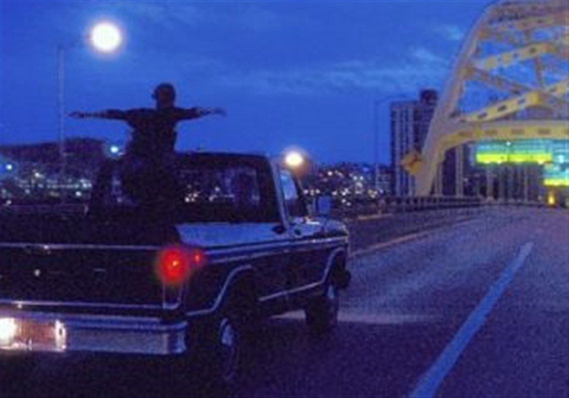
And in that moment,
I swear we were infinite.
The Perks of Being a Wallflower

The Perks of Being a Wallflower is a 2012 American coming-of-age drama film. An adaptation of the 1999 epistolary novel of the same name, it was written and directed by the novel's author, Stephen Chbosky. The film is set against the background of a young student, Charliw, who has been suffering from clinical depression from childhood setbacks and has recently been discharged from a mental health care institution to begin his adaptation to a normal lifestyle as a young high school student. Charlie is uneasy about beginning his freshman year of high school; he is shy and finds difficulty in making friends, but he connects with his English teacher, Mr. Anderson.
For the title I wanted to use a type that was clean and simple, but also bold. The feeling of something being infinite is a major part of the novel and I wanted to choose a font that fit that. It is dreamy and whimsical. The image I chose if from the film and it is the scene where the main character finally realizes how moments can be infinite.
The second front I chose is also a reference to the story. The main characer types letters on a typewriter so I wanted to incorporate that into this article. i chose to keep the body text just a plain font so it wasn't overwhelming as a whole.
