Fonts Should Be Part Of
The Design Process
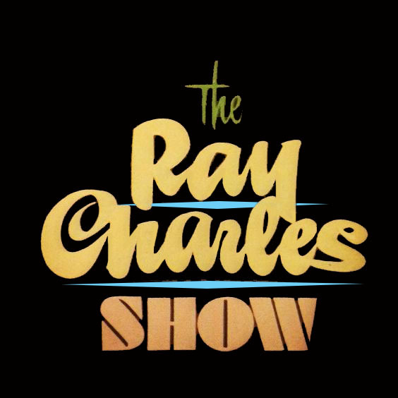
Use Fonts with Personality
 `````````````````````````````````````````````````
Fonts can be and should be part of the design process to add visual impact and interest to the content and to make the flow
of the site more visually appealing.
A good font combination, along with wise color choices make not only the message easier to read
but more appealing to view and sparks interest.
It is also a way to direct the eye to important messages and places on the page that you want the viewer to follow and pay special attention to.
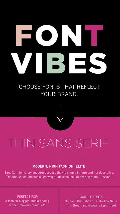
Fonts of specific style should match the message or feel that there connected to and possess a personality that fits with the content
and font combinations should always complement each other and never compete.
Font Characteristics and Pairing Thoughts
Friz Quadrata is a glyphic serif typeface that is highly recognizable with a strong, classic look and because of its level of detail and graphic weight, it is often used as a display font, for short texts and headlines. Distinct open bowls of lowercase letters with Short ascenders and descenders and Curved stroke endings.
Arial is a contemporary sans serif designed metrically identical to the popular typeface Helvetica, with all character widths identical, so that a document designed in Helvetica could be displayed and printed correctly without having to pay for a Helvetica license. It is an easy to read font for content and has mutiple style varations and weights. Arial is included standard on most PC's font packages.
Friz Quadrata has a bold appearance that works well for a heading or Business name or message. Used sparringly it works well and has a commanding appearance.
Arial complements Friz Quadrata with it's lighter weight and clean appearance that makes reading easier on the eye for extended copy.
Arial in this instance does share some of the same style characteristics of Friz Quadrata although
one is a serif and the other a san serif.Extenders and strokes have similarity that matches.
