8
Effective Web
Design Principles
You Should Know

8

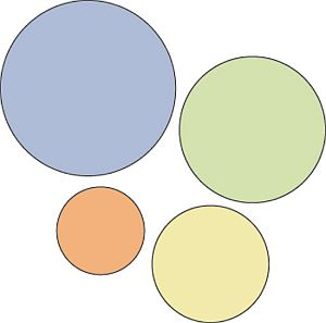
Squeaky wheels get the grease and prominent visuals get the attention. Visual hierarchy is one of the most important principles behind good web design. It’s the order in which the human eye perceives what it sees. Certain parts of your website are more important than others (forms, calls to action, value proposition etc), and you want those to get more attention than the less important parts. If you website menu has 10 items, are all of them equally important? Where do you want the user to click? Make important links more prominent. You should rank elements on your website based on your business objective. If you don’t have a specific goal, you can’t know what to prioritize.
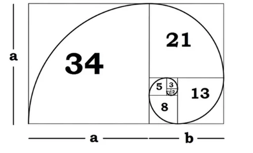
Golden ratio is a magical number 1.618 that makes all things proportioned to it aesthetically pleasing (or so it is believed). Then there is also the Fibonacci sequence where each term is defined as the sum of the two previous terms: 0, 1, 1, 2, 3, 5, 8, 13, 21 and so on. The interesting thing is that we have two seemingly unrelated topics producing the same exact number.
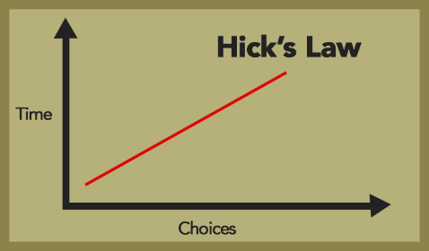
Hick’s law says that with every additional choice increases the time required to take a decision. You’ve experienced this countless times at restaurants. Menus with huge options make it difficult to choose your dinner. If it just offered 2 options, taking a decision would take much less time. This is similar to Paradox of Choice – the more choice you give people, the easier it is to choose nothing. The more options a user has when using your website, the more difficult it will be to use (or won’t be used at all). So in order to provide a more enjoyable experience, we need to eliminate choices. To make a better web design, the process of eliminating distracting options has to be continous throughout the design process.
It’s a good idea to use images in your design. A visual communicates your ideas much faster than any text. The best images follow the rule of thirds: an image should be imagined as divided into nine equal parts by two equally-spaced horizontal lines and two equally-spaced vertical lines, and that important compositional elements should be placed along these lines or their intersections. Using beautiful, big images contributes to design as it is (not withstanding the growth of Pinterest), following this rule will make them more interesting and thus your website more appealing.
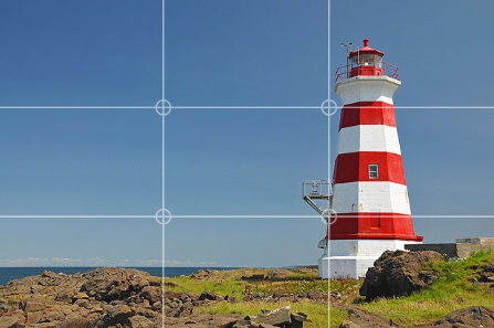
It’s a good idea to use images in your design. A visual communicates your ideas much faster than any text. The best images follow the rule of thirds: an image should be imagined as divided into nine equal parts by two equally-spaced horizontal lines and two equally-spaced vertical lines, and that important compositional elements should be placed along these lines or their intersections. Using beautiful, big images contributes to design as it is (not withstanding the growth of Pinterest), following this rule will make them more interesting and thus your website more appealing.
Gestalt psychology is a theory of mind and brain. Its principle is that the human eye sees objects in their entirety before perceiving their individual parts. The key takeaway here is that people see the whole before they see the parts. People always see the whole of your website first, before they distinguish the header, menu, footer and so on. As one of the founders of gestaltism Kurt Koffka said: the whole exists independently from the parts. There are 8 so-called gestalt design laws that allow us to predict how people will perceive something. Here are a few:
People group things together that are close together in space. They become a single perceived object. With effective web design, you need to make sure things that do NOT go together, are not perceived as one. Similarly, you want to group certain design elements together (navigation menu, footer etc) to communicate that they form a whole.
We group similar things together. This similarity can occur in the form of shape, colour, shading or other qualities.
We seek completeness. With shapes that aren’t closed, when parts of a whole picture are missing, our perception fills in the visual gap. Without the law of closure we, would just see different lines with different lengths, but with the law of closure, we combine the lines into whole shapes. Using the law of closure can make logos or design elemets more interesting.
The mind perceives objects as being symmetrical and forming around a center point. It is perceptually pleasing to be able to divide objects into an even number of symmetrical parts.
White space (also called ‘negative space’) is the portion of a page left “empty”. It’s the space between graphics, margins, gutters, space between columns, space between lines of type or visuals. It should not be considered merely ‘blank’ space it is an important element of design. It enables the objects in it to exist at all. White space is all about the use of hierarchy. The hierarchy of information, be it type, colour or images. A page without white space, crammed full of text or graphics, runs the risk of appearing busy, cluttered, and is typically difficult to read (people won’t even bother). This is why simple websites are scientifically better. Enough white space makes a website look ‘clean’. While clean design is crucial to communicating a clear message, it doesn’t just mean less content. Clean design means a design that makes the best use of the space it is in. To make a clean design, you have to know how to communicate clearly by using white space wisely
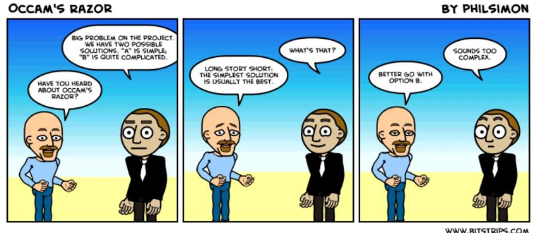
Occam’s razor is a principle urging one to select among competing hypotheses that which makes the fewest assumptions and thereby offers the simplest explanation of the effect. To put it in the design context, Occam’s Razor states that the simplest solution is usually best. Simple, minimal design does not automatically mean the design works, or is effective. But in my experience simple is always better than the opposite – and hence we should strive to simplify.