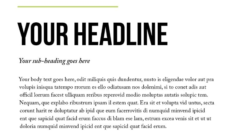
This is the most common font pairing style designers will use when they want to make their typography look instantly more polished and professional. Why does this font pairing work so well? Firstly, the pairing has high contrast, which creates interest and stimulates the eye. Secondly, this pairing feels at once both classic and contemporary, which makes it suitable for all sorts of layouts. Finally, bookish serifs tend to be easy to read, while sans serifs add a more modern, sophisticated flourish, making it a pairing that’s both functional and stylish.
One of our favourite font pairings is headlines set in Bebas Neue, with body text set in Caslon. A sub-heading set in Adobe Caslon Pro Italic adds the perfect finishing touch.
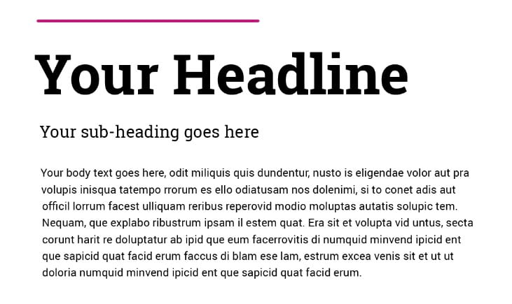
Most fonts belong to a typeface family—a group of fonts which vary in weight (e.g. bold, italic, book etc) but ultimately have the same base design. A family may also include more stylised variations of the original roman weight, such as condensed, outlined and expanded. Some font families contain as few as three fonts, while others might extend to include dozens of fonts. These larger font families are known as ‘superfamilies’. Pairing two fonts taken from either the same family or superfamily is a quick route to creating a design that feels pulled-together and elegant. The success of this sort of pairing rests on the shared similarities between the chosen fonts, rather than contrast, which has a calming effect on the eye. For layouts which require a more traditional, formal or conservative style, this sort of font pairing is the perfect choice. That’s not to say that sourcing two fonts from the same family needs to be dull. In fact the vast range of font styles you can track down within a superfamily can give you plenty of variation, to keep your design looking playful.
We love the combination of a Roboto Slab headline with Roboto body text. These fonts have very different weights but share the same rounded-geometric form.
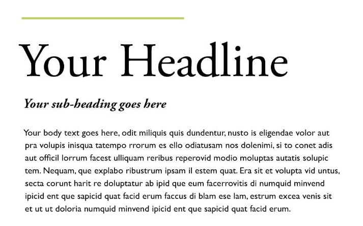
All fonts have a personality, whether it’s the bouncy optimism of a rounded sans serif or the serious conservatism of a traditional serif. Each font brings its own personality to a design, helping to give the whole layout a certain mood or vibe. Professional typographers call this evasive sense of mood that a group of fonts share a ‘sub-category’. Some serif fonts, such as Bembo and Garamond, fall into the Old Style sub-category, with these fonts tending to have an old-fashioned, dignified personality. These work well paired with Humanist sans serifs like Frutiger and Gill Sans, because these too have an old-fashioned, serious mood.
Here a Garamond headline and sub-heading makes a great team alongside Gill Sans body text.
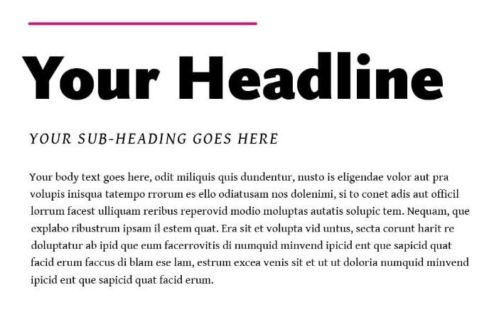
You don’t always need to rely on blowing your headline up to large size to make an impact. Display or Headline fonts are specially designed to make text really shout for attention. These heavily stylised or chunky display fonts, such as FF Scala and Eczar, look fantastic paired with Humanist or Transitional body text, whether in serif or sans serif styles. If you’re putting together a more design-forward layout which needs to grab a viewer’s attention, such as a poster or magazine cover, this font pairing won’t fail to turn heads, and it looks super-stylish too. Here a headline set in Scala Sans Black is the perfect foil to the simple charms of Gentium Basic.
Here a headline set in Scala Sans Black is the perfect foil to the simple charms of Gentium Basic.
Rounded fonts are youthful, and used alone give an almost childlike quality to a design. Pairing a rounded sans serif headline, like Woodford Bourne or Quicksand with more traditional serif body text exaggerates further the contrast that we looked at with the serif/sans serif font pairing at the start of the article.
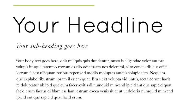
This is a more space-age version of that pairing rule, giving layouts a futuristic spin that feels clean and cutting-edge. In this example the exaggerated tracking of Quicksand as the headline makes the ultimate contrast with neat and pulled-together Garamond.
See the latest trends in font pairing!