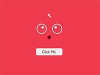
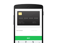
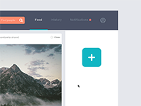
Everyone loves clever design, but if it's too clever, it will irritate people. Ditch the gimmicks and complex animations, and keep it in-line with what your users expect.
Microinteractions are contained product moments that revolve around a single use case—they have one main task. Every time you change a setting, sync your data or devices, set an alarm, pick a password, log in, set a status message, or favorite or “like” something, you are engaging with a microinteraction. They are everywhere: in the devices we carry, the appliances in our house, the apps on our phones and desktops, even embedded in the environments we live and work in. Most appliances and some apps are built entirely around one microinteraction.
Microinteractions are good for:
Even though we’re surrounded by microinteractions every day, we don’t usually notice them until something goes horribly wrong. But microinteractions are, despite their small size and near-invisibility, incredibly important. The difference between a product you love and a product you tolerate is often the microinteractions you have with it. They can make our lives easier, more fun, and just more interesting if done well.
It’s likely that you started your day with a micro-interaction. By turning off the alarm on your mobile phone, you engaged with a user interface in a single moment. You will continue to engage throughout the day in these moments with your digital devices. Each one is a micro-interaction. Each one is probably so small you don’t think about it. And each one works because of that simple fact.
By using microinteractions, you can give the user a fun experience and a rewarding one as well. Microinteractions are that little spice or addition that can make or break their interaction with your product.
When it comes to the design of micro-interactions, it can be tricky or even considered boring by some. The design elements are so small and can happen so quickly that designers might easily forget the details. Don’t make that mistake. The importance of micro-interactions can’t be over-emphasized. These are the details that make users love or hate an app or website. This simple, wonderful usability is why you choose one alarm clock or weather app over another. And someone had to design that.
So that is why you SHOULD use microinteractions, because even though most people do not realize it, they deal with microinteractions every day and would miss them if they were not there.
A Trigger initiates a microinteraction. There are two types of triggers. Manual triggers are user initiated while system triggers are automated.
The Rules determine what happens. Rules are the constraints on, and parameters of, a user flow. Rules basically govern the way a user interacts with the product. Rules are usually intuitive and understated.
Feedback lets people know what is happening. Feedback can be visual, aural or tactile. Visual is by far the most predominant means of providing feedback. AUral can be annoying and tactile is reserved for touchscreens.
Loops and Modes determine the metarules of the interaction. Loops determine how long the microinteraction goes on for. Does the microinteraction end immediately, or does it repeat forever?
Your users expect the microinteraction to activate immediately - within 0.1 seconds if we're being precise. Anything longer, and it'll be dissociated with the initial action...and will probably annoy your users too.
Everyone loves clever design, but if it's too clever, it will irritate people. Ditch the gimmicks and complex animations, and keep it in-line with what your users expect.
Yes, we know your designs rock. But complex typography, muted colors and lack of structure will confuse your users. Don't add more detail than you need and aim to communicate the message as quickly and effectively as possible!
Your text should read like people talk. It should communicate human emotion, and all your copy should match the moment. Keep it light-hearted, but also respectful and helpful.
Your microinteraction should mimic natural human behavior. Keep it familiar, and always keep in mind human error (and how you can prevent it). For example, think of hover states or custom cursor pointers. Reebok's intuitive cursor and hover to close-up are classic ecommerce features put to great use.
Animations aren't just aesthetically pleasing; they can enhance the user experience. Make sure that your animation informs about progress, but doesn't burden current actions. If they're visually stunning, that's great - but it's more important that they're useful.
Contrast is great if you're trying to highlight a specific process or action. However, use it too much and you'll distract your user. Make sure the balance is harmonious on your site, and that every moment is visually connected to your overall app design. When it comes to microinteraction, it should all be about complementing the bigger picture
Remember, your microevolution doesn't have to behave the same every time it's used. It can evolve with additional actions and make the experience even more user engaged.