Typography Trends in Website Design
by Sandy Rushman
Mix and Match
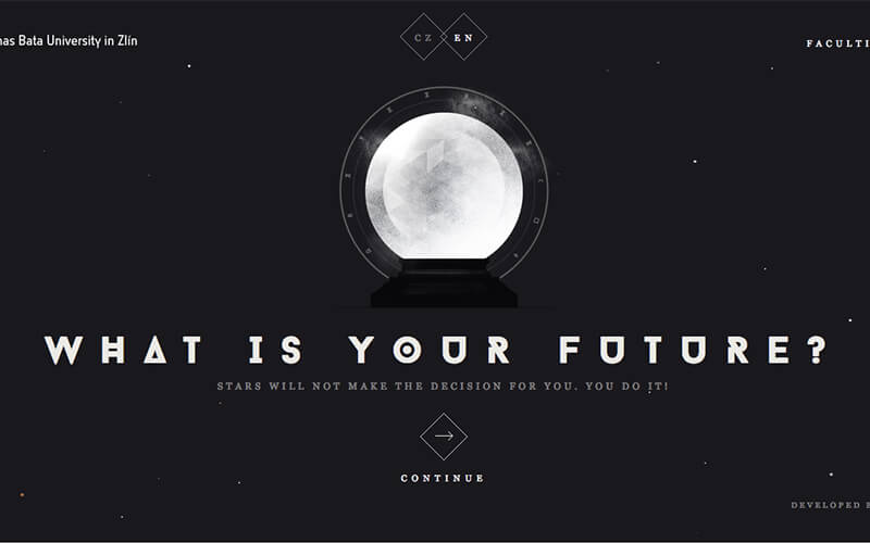
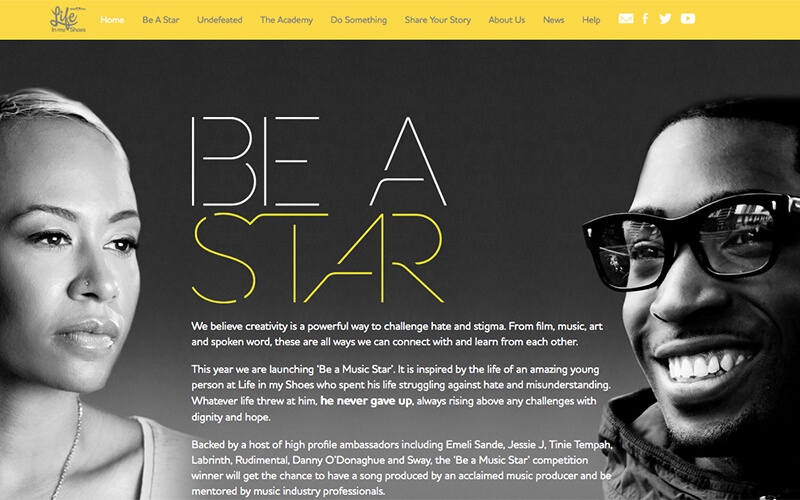
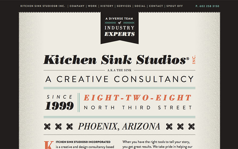
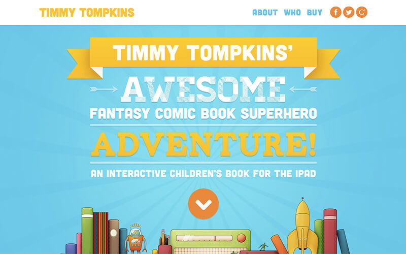
The mix and match typography trend was popularized in 2013 and continues to grow. There really is an art to choosing fonts that work well together. Typography is pushed to the next level with this trend, that allows designers to go nuts with multiple typefaces. It might sound busy and confusing to use so many fonts together, but if done the right way, it can look beautiful and artistic. So, how do you achieve the mix and match look? Let's go over some basic rules and guidelines.
First, make sure you pay attention to scale and proportion. You want to use fonts that are very similar or very different, not in between. Next, unify your fonts with a certain color or style. Pay attention to priority and emphasis of different fonts. Make sure your body text is readable. The mix and match style works best for headlines and larger text. Lastly, you don't have to go crazy with different typefaces; it can be as simple as using one typeface in different styles, like bold and italic.
Over an Image
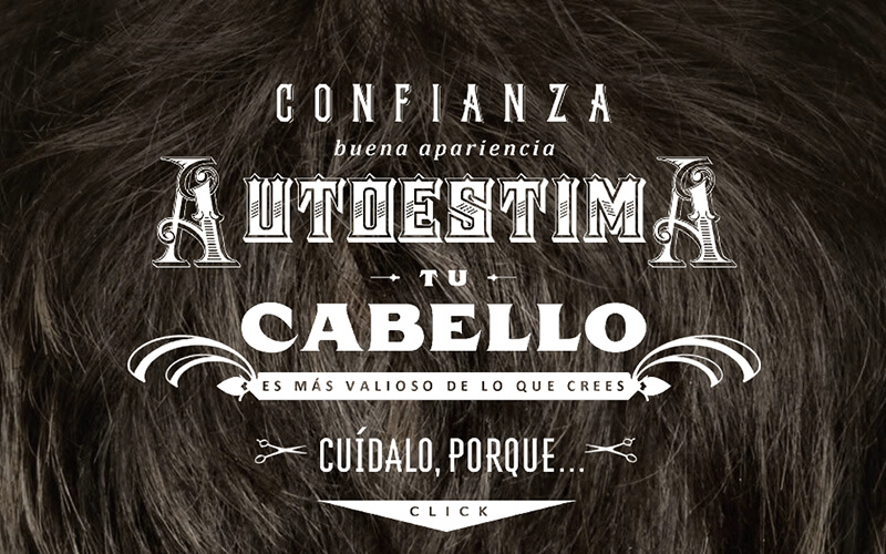
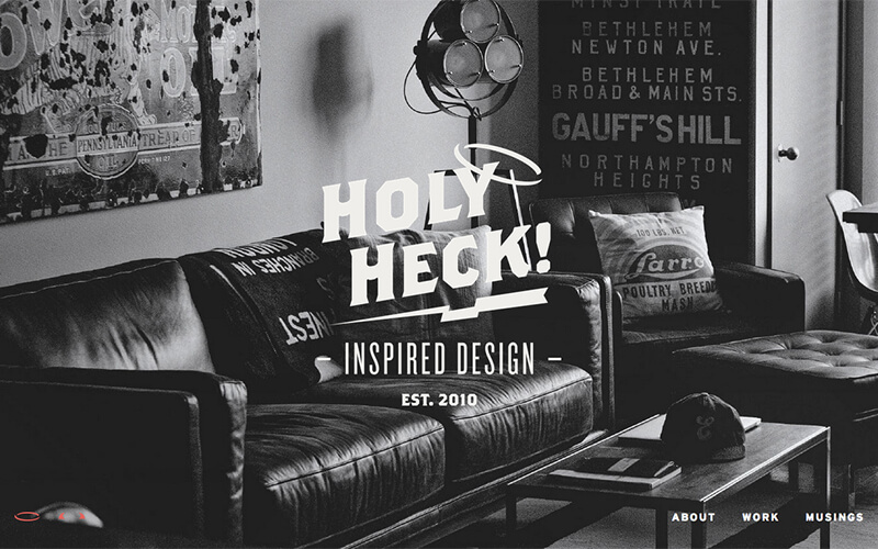
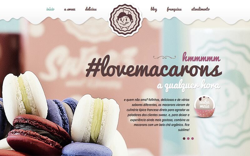
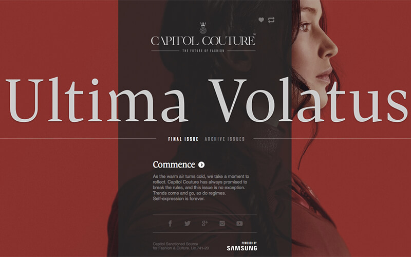
Superimposing text on top of an image has been popular for years, but has recently been seen more in website design. Images used to have to be small because of slower bandwidths, but now we're in a time where large hero images are a trend and text over an image pairs nicely with that trend.This technique is not as simple as it may sound, though. If not done correctly, your website can look very unprofessional. So, let's go over some rules and guidelines for this trend.
First, contrast and positioning are super important. You don't want to use white text over a very light image. The viewer has to be able to read your type. Pick an image with depth and put the text over an out of focus area. If using an image fully in focus, you can use an overlay or edit the image to make the text stand out more. Also, make sure your image choice matches your content; you don't want to use a picture of a celebrity with your name on top of it.
Extreme Size
BIG
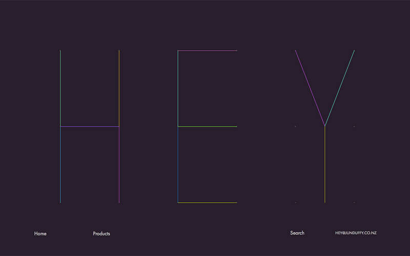
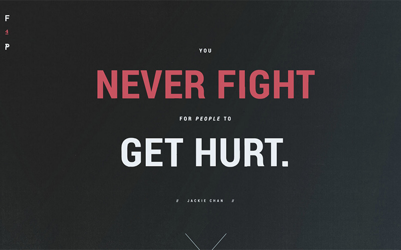
Big text sends a powerful and assertive message. Some guidelines for using larger text are: the text should have a larger proportion and weight compared to other elements on the screen, characters should be larger than 85 points, and caps or extremely thick strokes are used. The big text trend is great for getting a point across or drawing focus to a certain part of your website.
SMALL
The opposite of big text, small text can be used for a softer message. Just like big text, small text grabs a viewer's attention because it is so tiny compared to other elements on the screen. Just because it is small, though, does not mean it can't stand out. Make sure other elements on the website, though bigger, don't overshadow the small type. This trend works well over images.
Handwritten
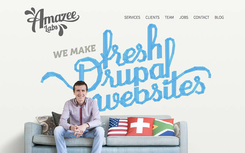
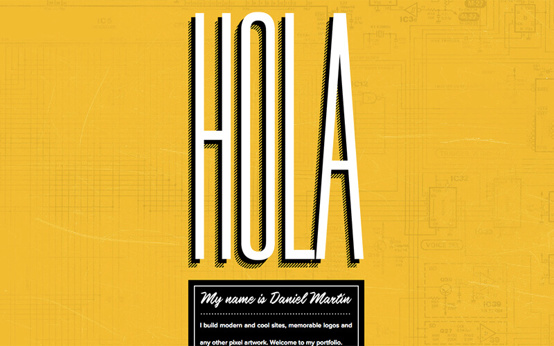
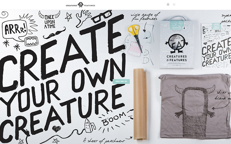
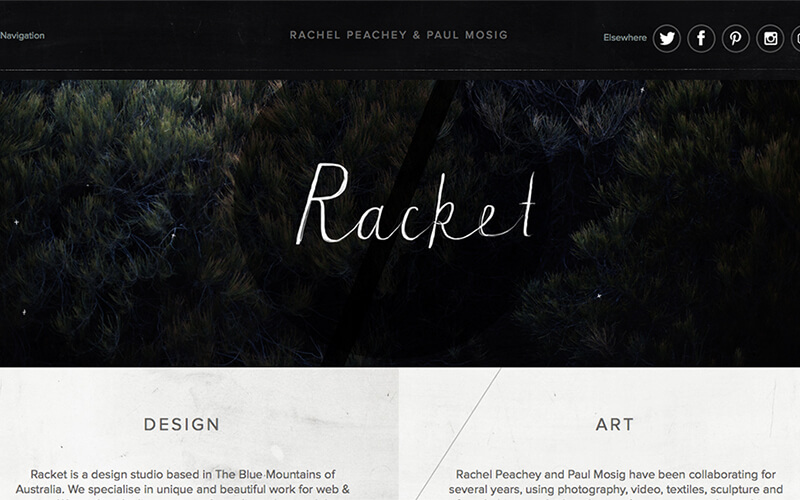
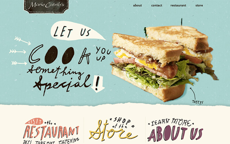
Handwritten typography is a growing trend in website design. Once used only for websites aimed at children or comics, this trend can now be seen on more serious websites. Handwritten fonts look best as headlines and larger text. There are so many handwritten fonts available now. You can even make your own unique font, using your handwriting. This style doesn't work for every website, though, so let's go over some simple rules and guidelines.
First, use the handwritten font as an art element. Sometimes, handwritten fonts are hard to read, so you should only use them for large, short pieces of text. Use this style sparingly; it shouldn't be used for large bodies of small text. You should think beyond the typical cursive handwriting. Handwritten can be anything done by hand and it can be as creative as you want it to be. Lastly, if you're using this trend, your type should look handwritten! That's the whole point, right?
Decorative
There are so many font choices in the design world, right now, and many fall into the decorative category. Many designers don't like to use decorative typefaces because they're seen as cheap, messy, or unprofessional. Nonetheless, it is a growing trend and if done correctly it can take your website to another level. Picking a decorative font that is right for your website and message is super important and use it sparingly. You don't want to use a decorative font for body text.
Decorative fonts can also be referred to as novelty, ornamental, or display. They include unusual and unique designs that don't fit into other groups. This trend should be used for headlines or titles for full effect. The name of a decorative typeface, usually describes the font. Decorative fonts can also include pictures, or little icons. The possiblities really are endless with this trend. They really allow a designer to have more fun and step away from the typical serif and sans-serif type.
