Professional Web Fonts

Font Readability

"Some of the best type advice I ever received came early on from my first typography teacher: pick one typeface you like and use it over and over for months to the exclusion of all others. While this kind of exercise can feel constraining at times, it can also serve as a useful reminder that the quantity of available choices in the internet age is no substitute for quality."

- Dan Mayer

Readable Fonts

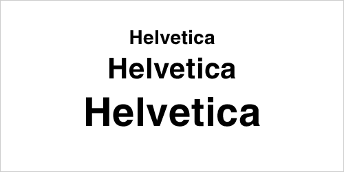
Helvetica
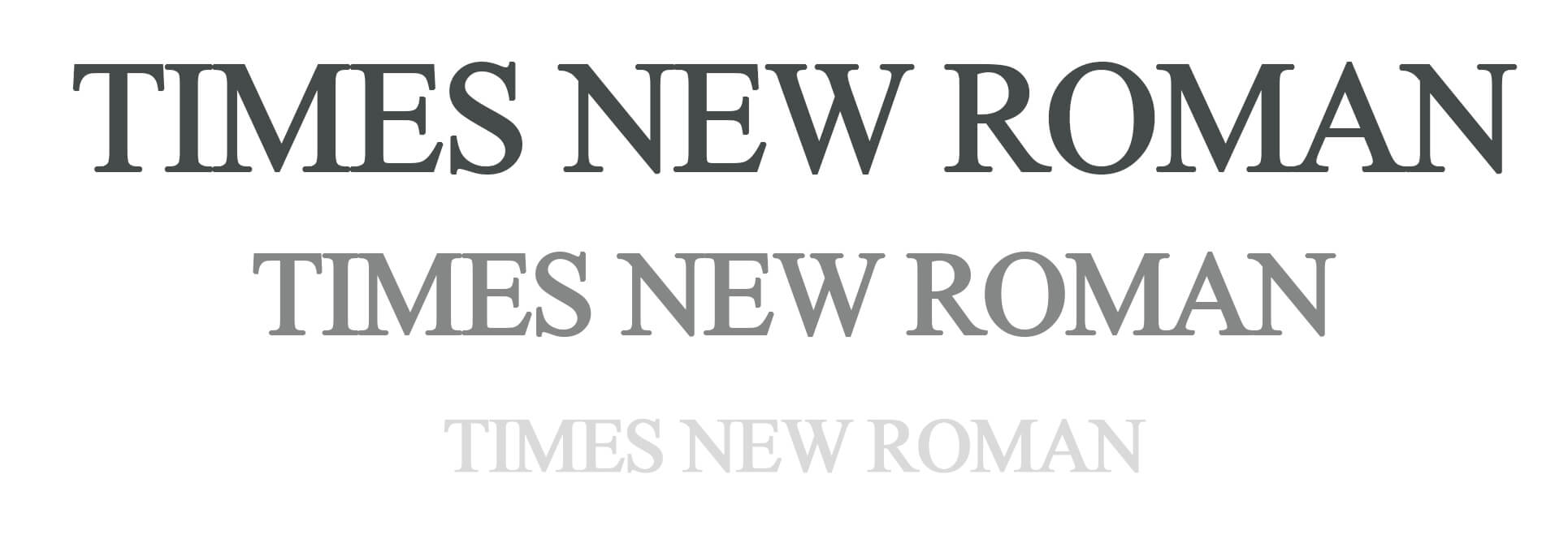
Times New Roman
Frutiger
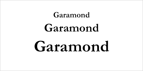
Garamond

Fonts To Avoid

Arial

Monotype Imaging Foundry

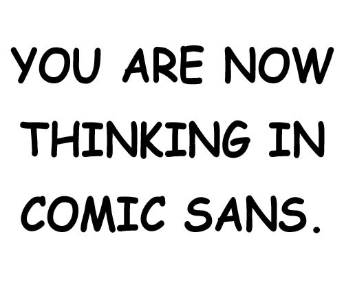
Comic Sans
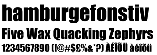
Impact

Stephenson Blake Foundry

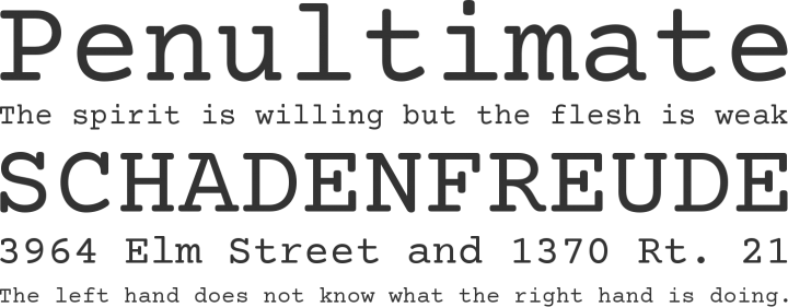
Courier

Font Colors

"The W3C, which all designers and developers turn to for current web standards, states 'a contrast ratio of 3:1 is the minimum level recommended by [ISO-9241-3] and [ANSI-HFES-100-1988] for standard text and vision.'

UXBooth.com notes that, while these rules imply that higher contrast ratios are ultimately better, some people suggest that too high of contrast actually hurts to read, and use of off-white backgrounds, or off-black text instead of 100% black on white."

- Luis Hernandez

Readable Colors

Dark Grey
Navy Blue

Un Readable Colors

Teal
Yellow

Font Innovators